Primary Goals:
Our goal is to provide substantive commentary for a general readership. By screening submissions, we have created a space where readers can exchange intelligent and informed commentary that enhances the quality of our news and information.
-
Facilitate readers' discussion on Scroll and other products.
-
Introduce a friction-free account creation.
-
Create intuitive Moderation experience.
Pattern
-
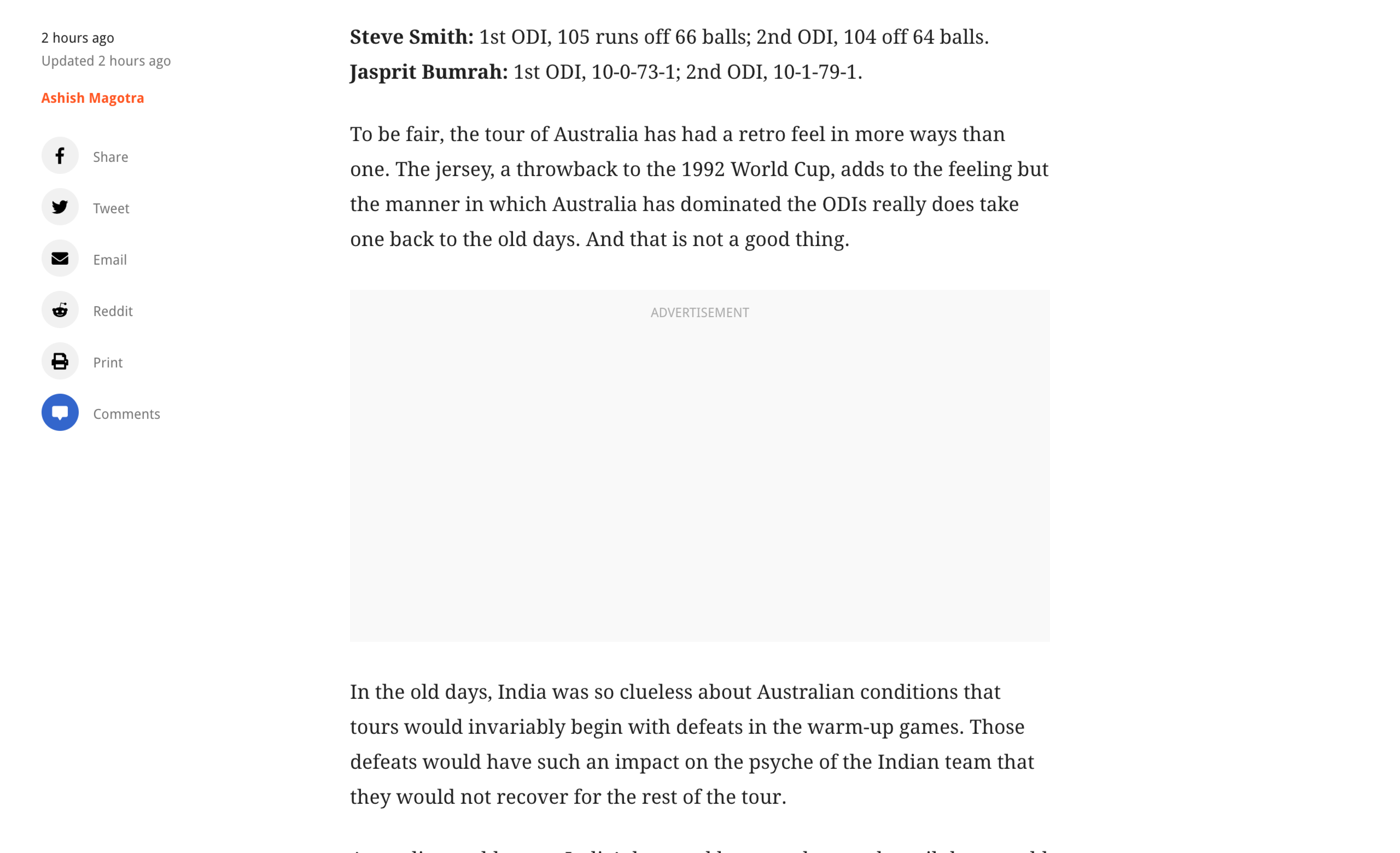
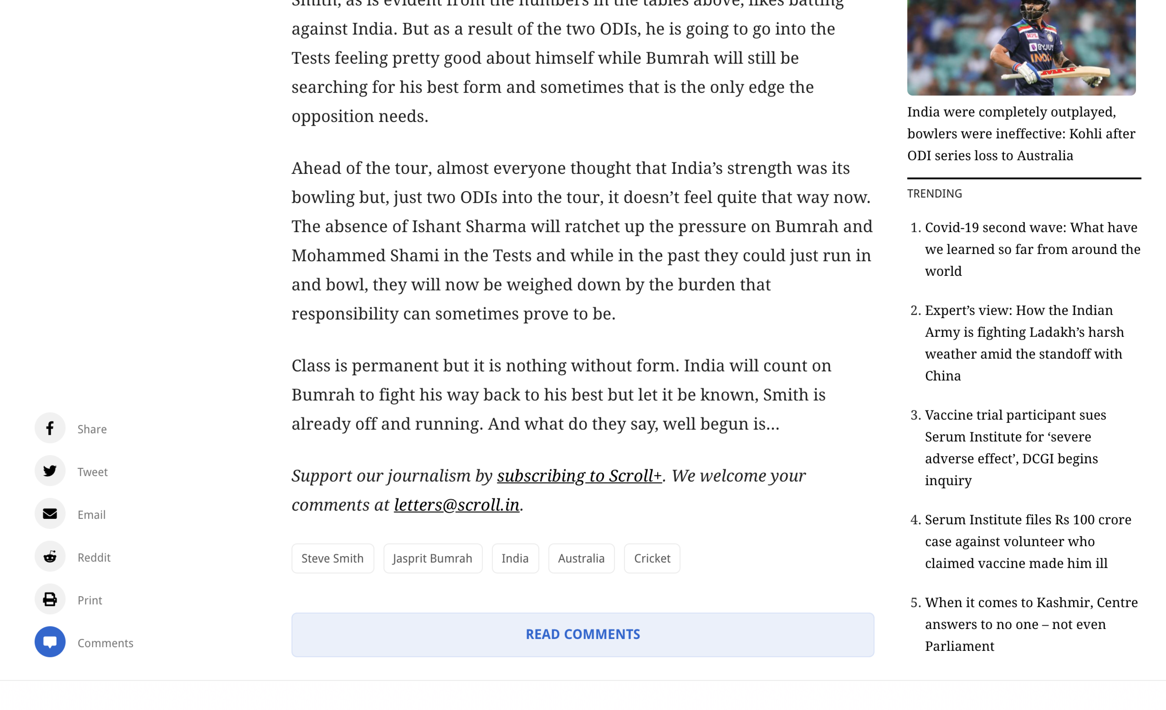
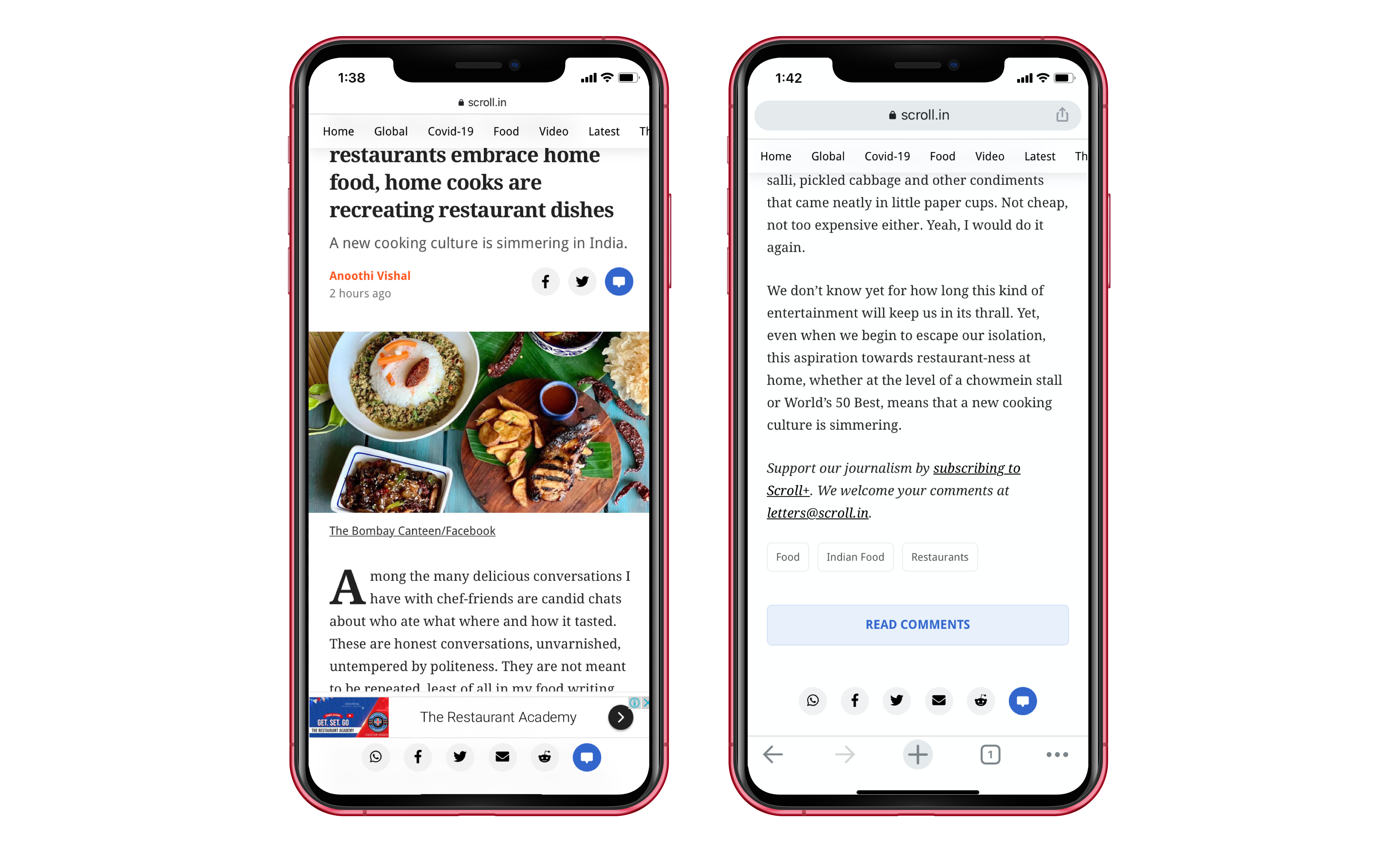
Entry points; on share-bar and a button below the article that opens the Comments experience for readers.
-
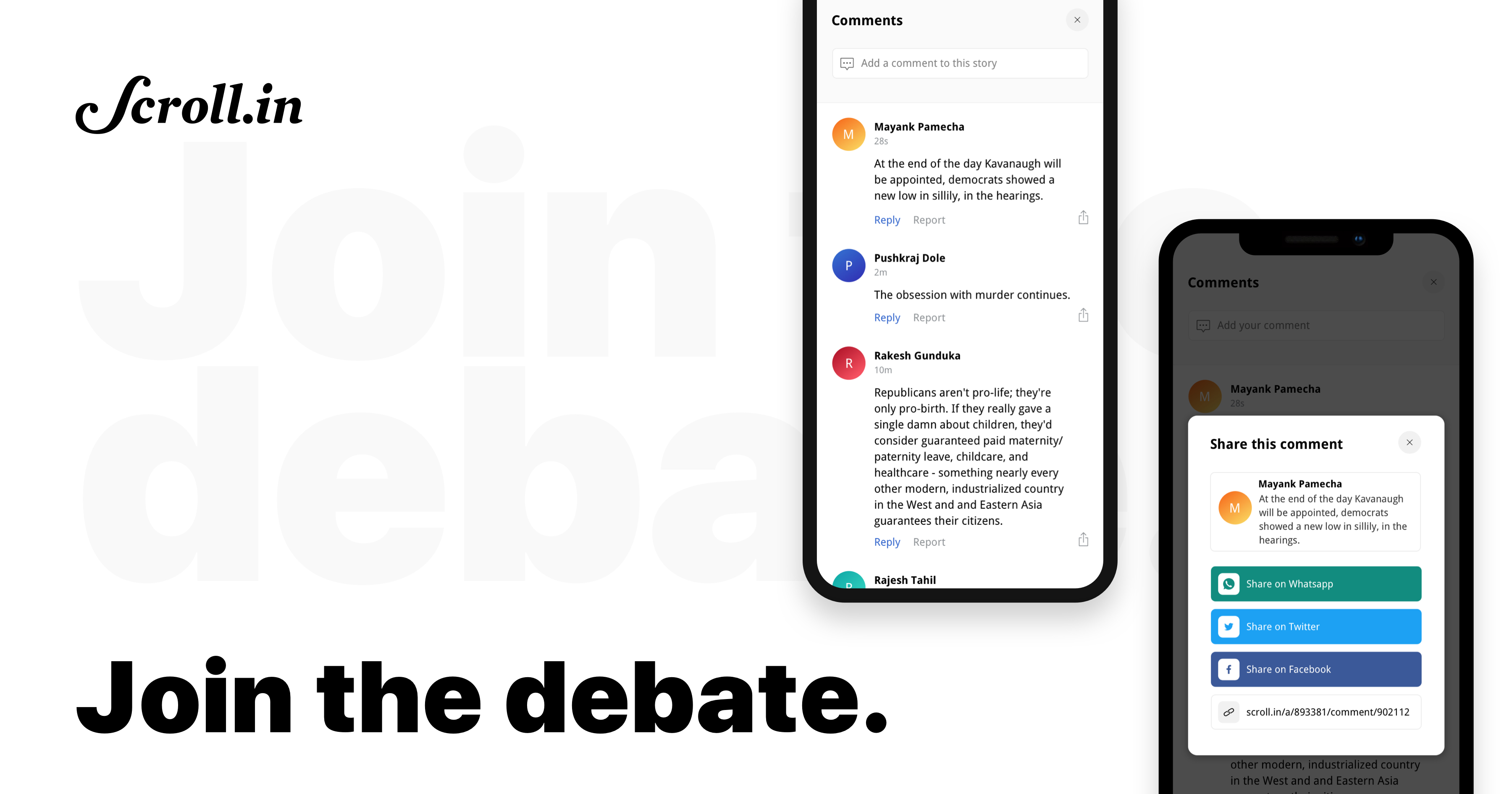
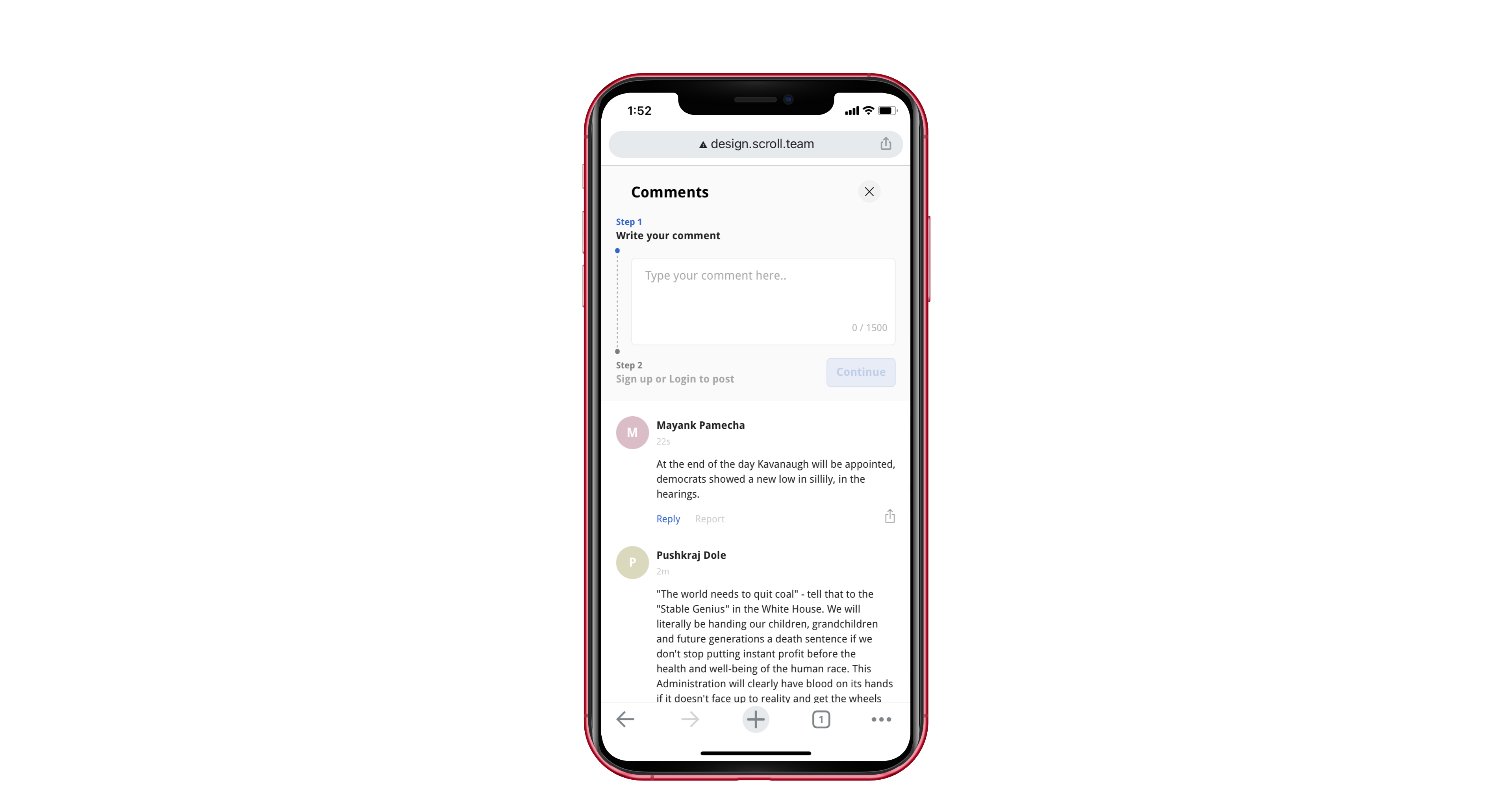
On mobile, full-screen comments modal
-
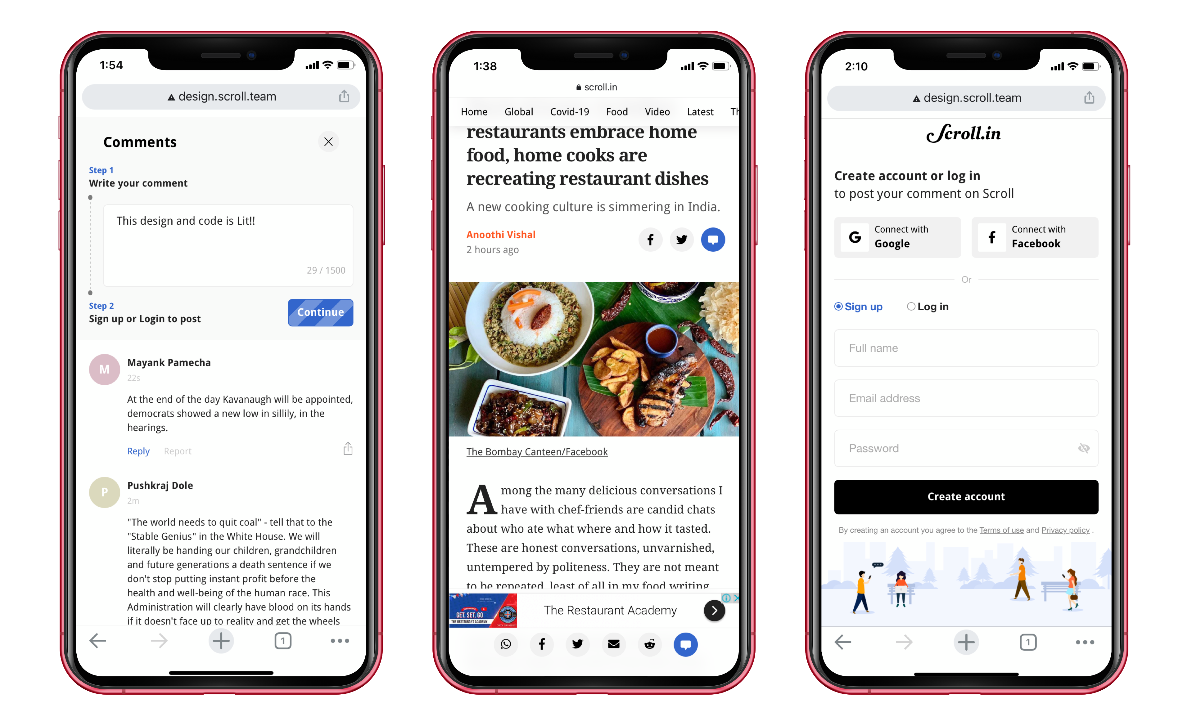
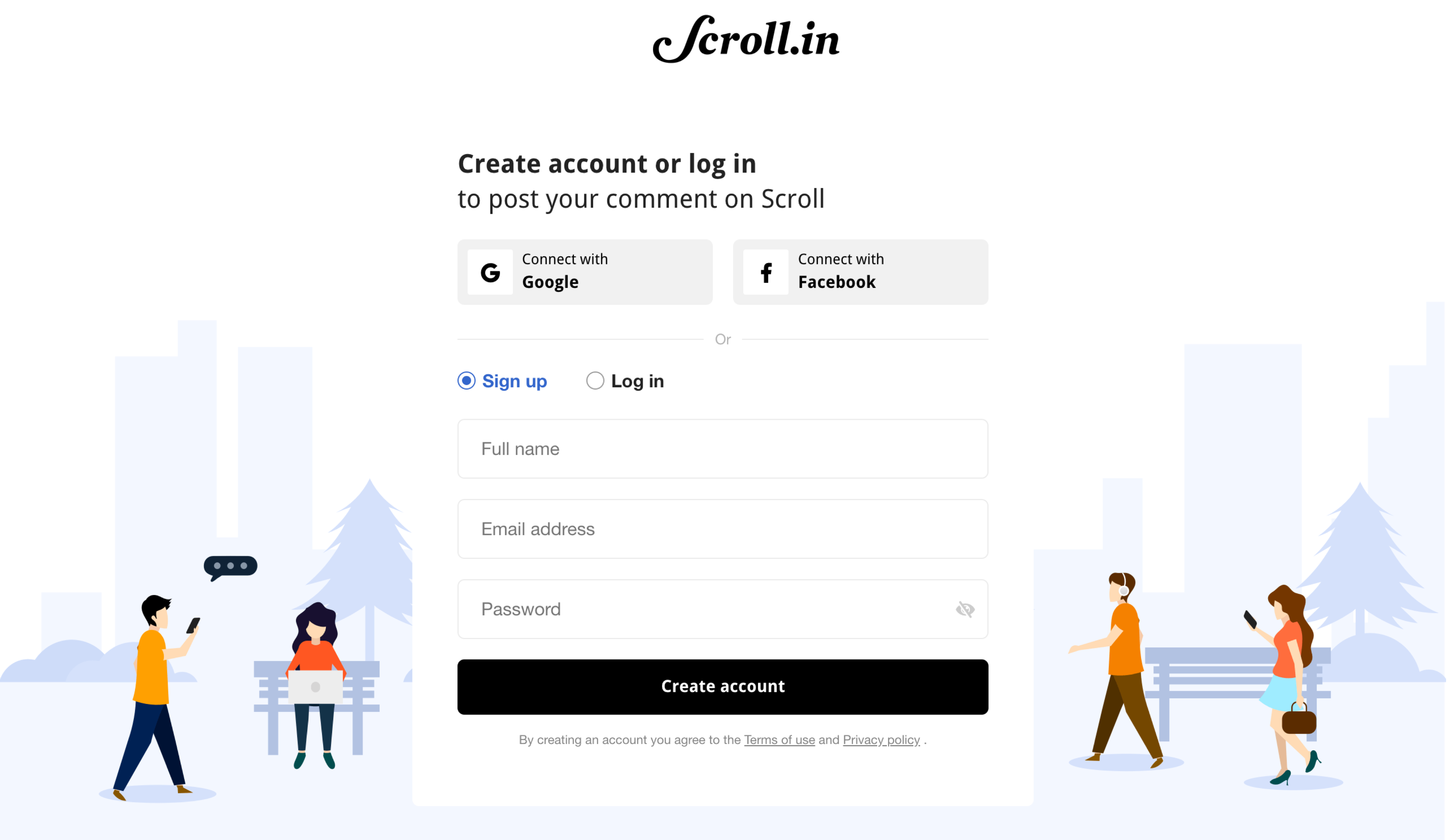
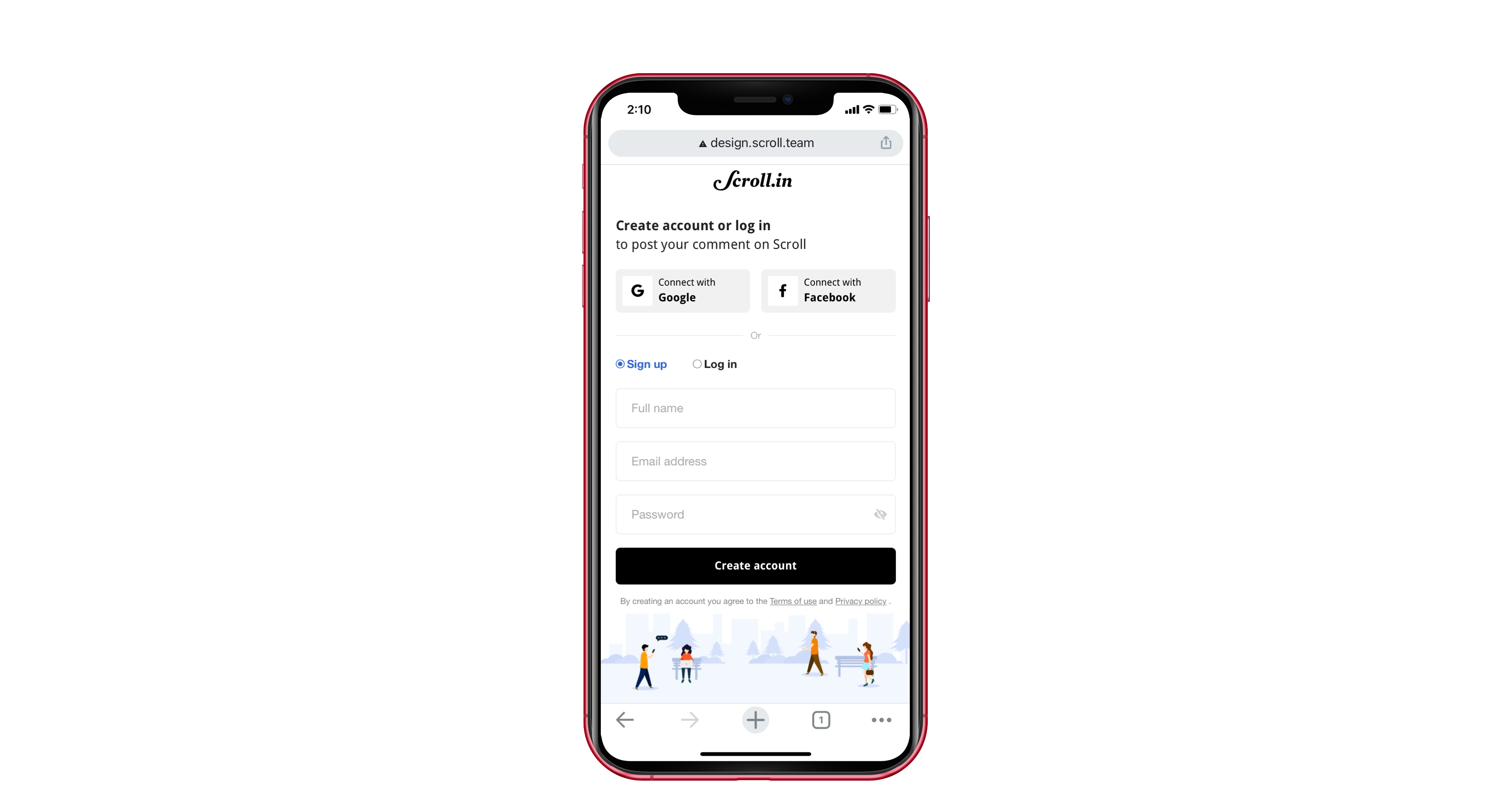
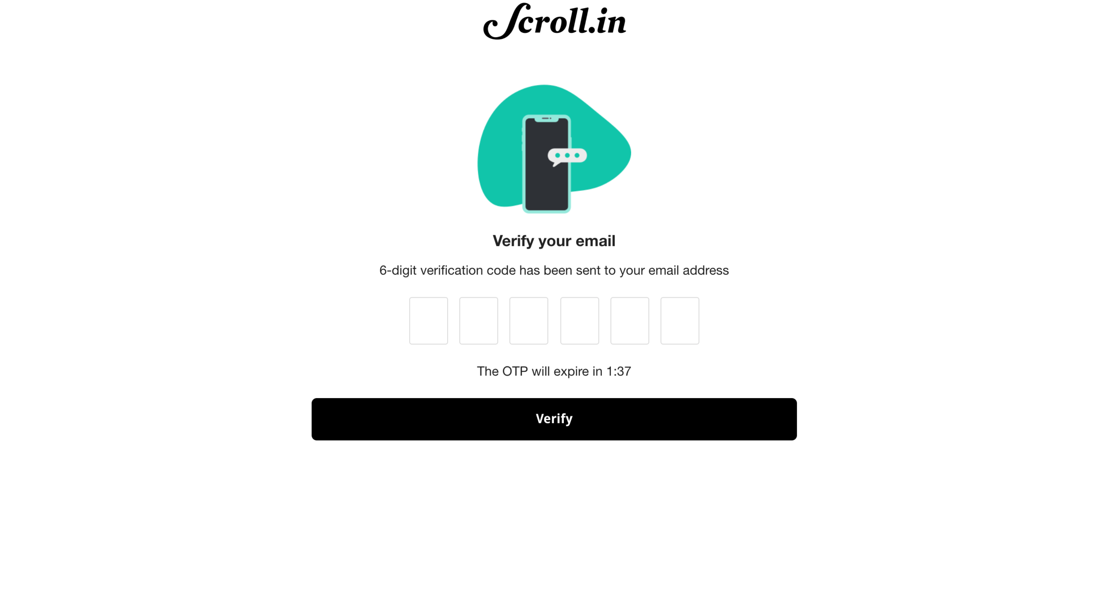
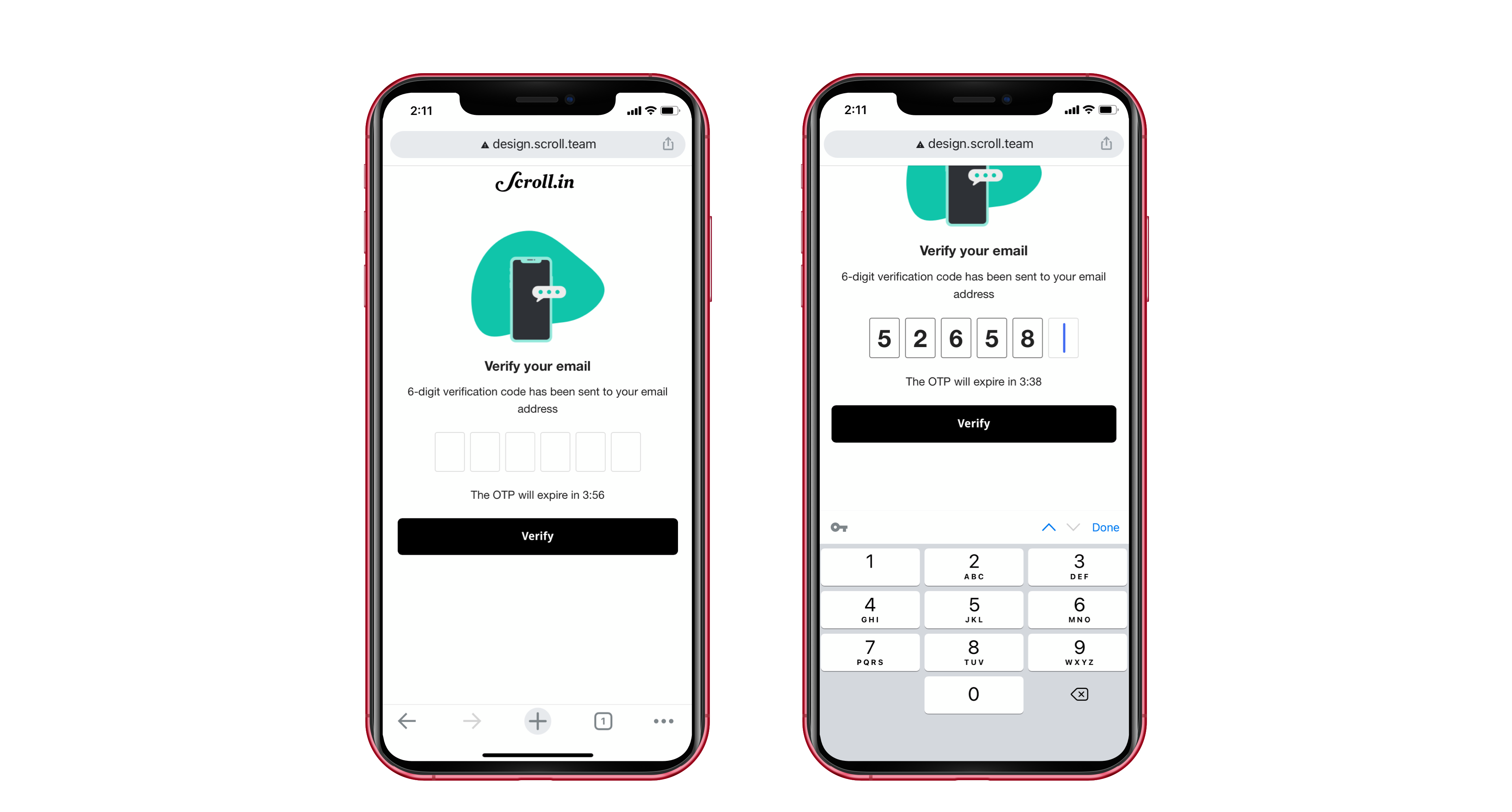
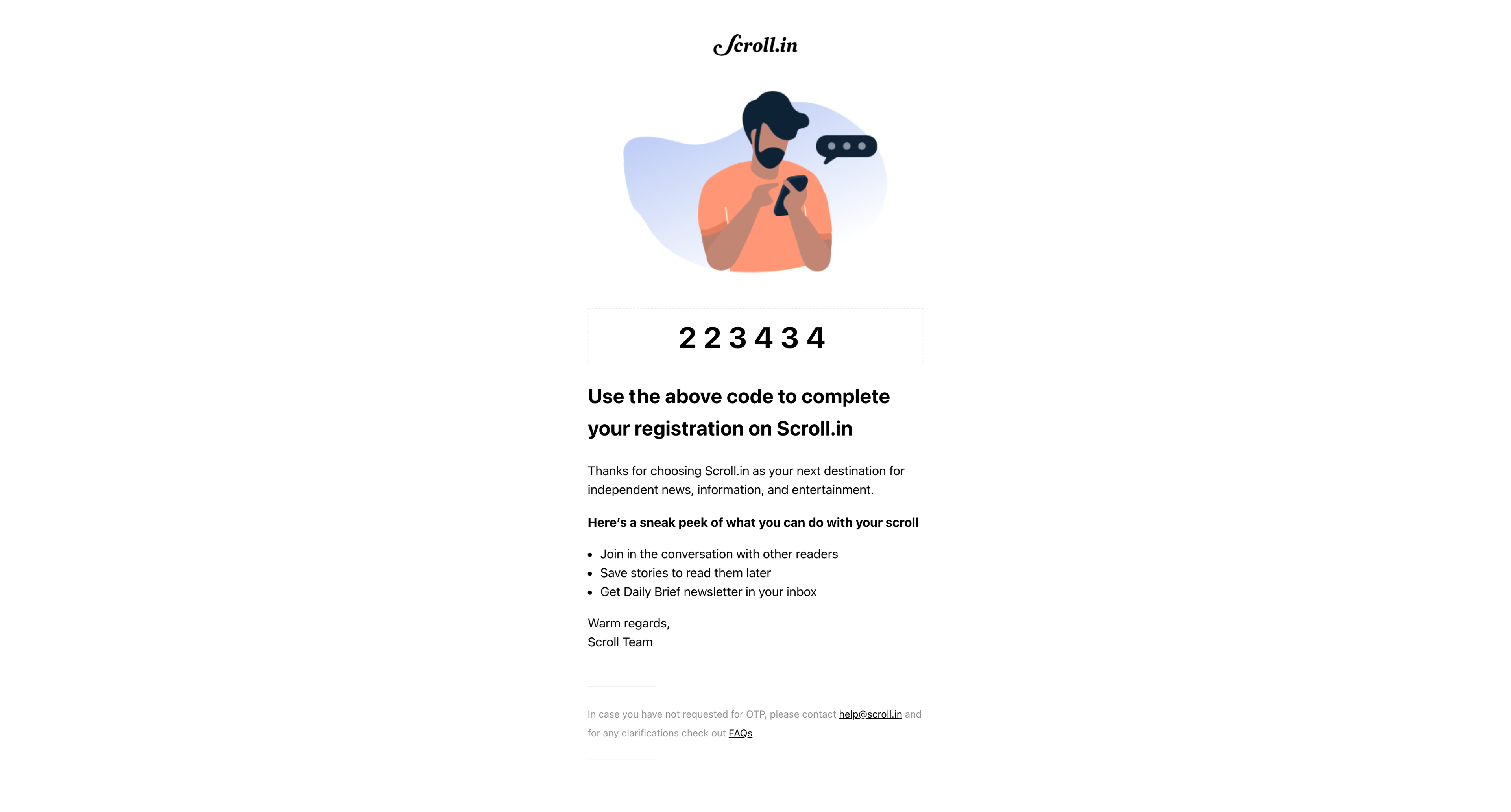
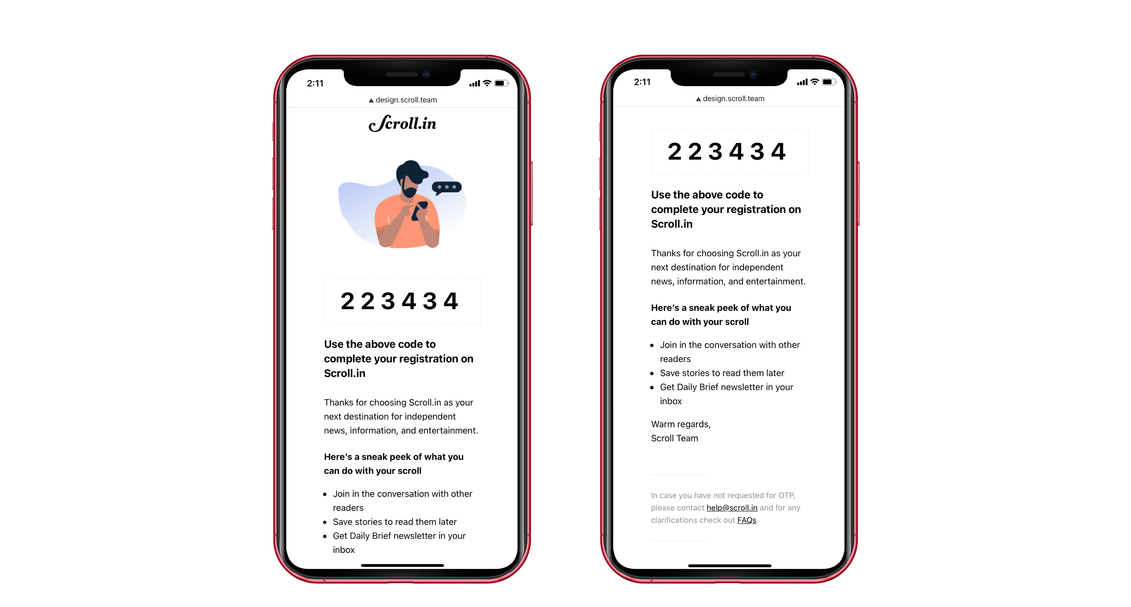
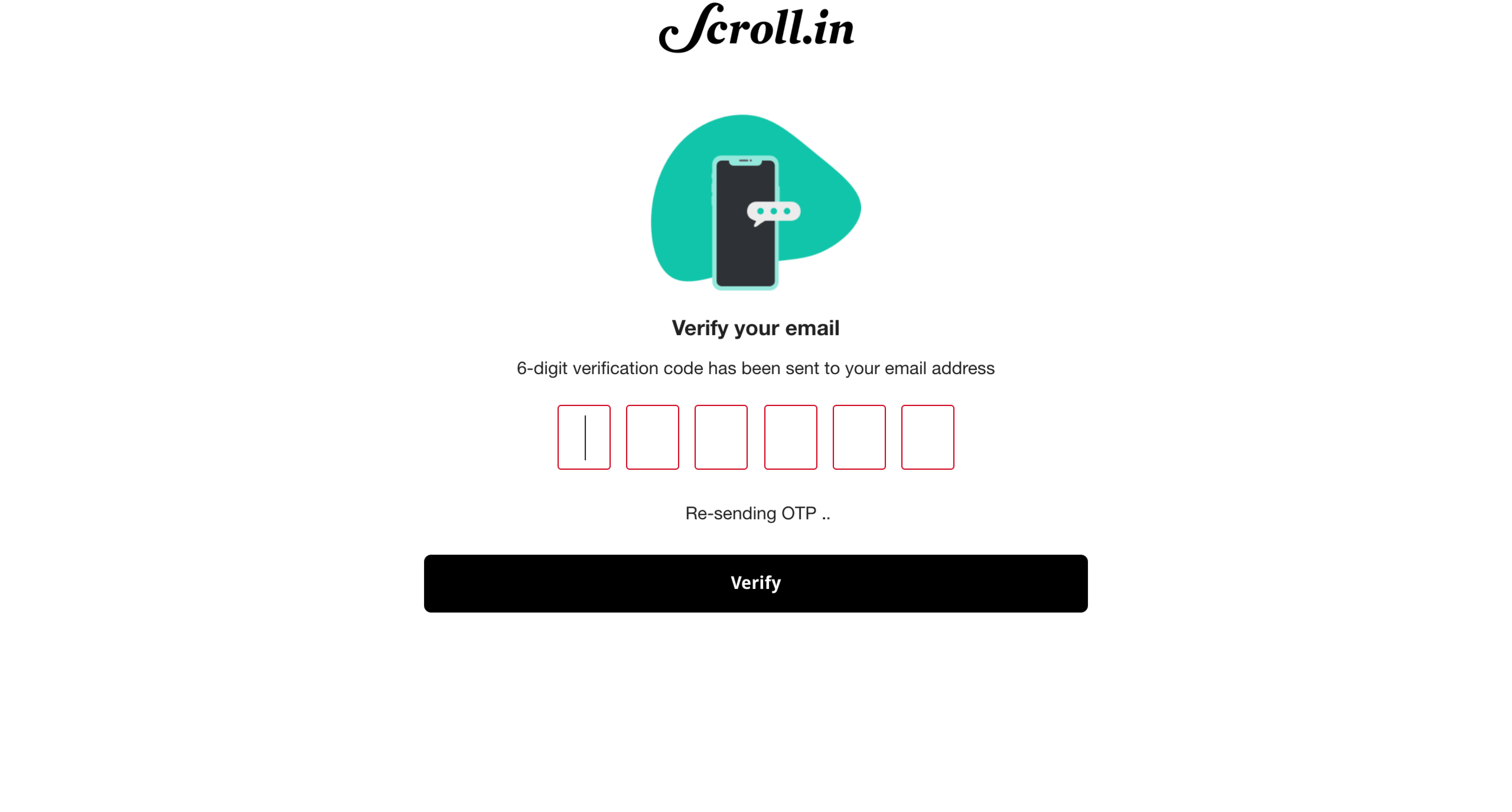
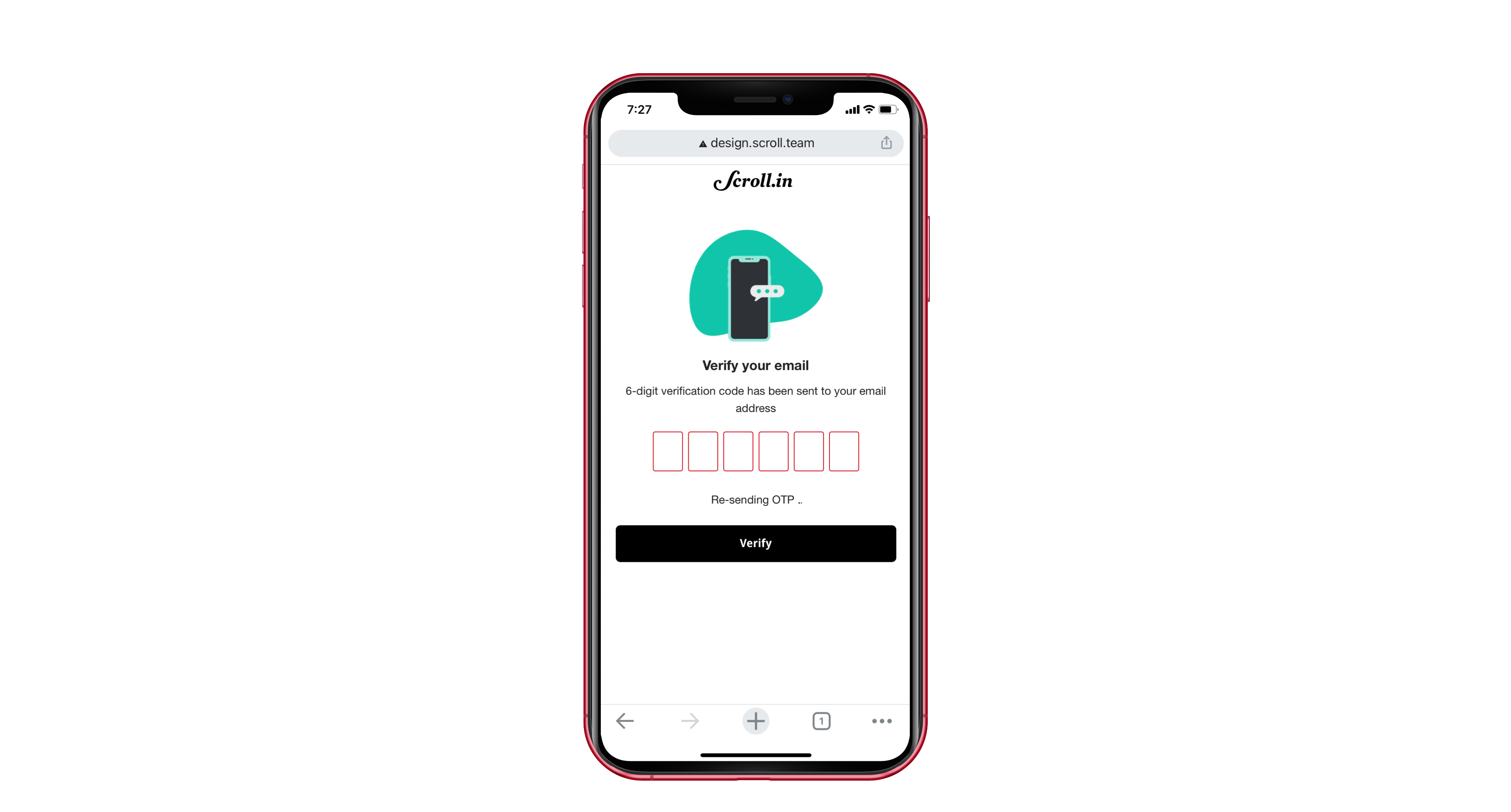
2 ways to solve registration before commenting; 1. a reader comments, enters their email id, hit a 'Post' button. Upon verifying their email, the comment shows up on Scroll. 2. a reader hits a login/share your thoughts button, gets redirected to login/register screen, then gets redirected back to article they were reading. In this scenario, they might have to hit the comment button again to write their thoughts.
-
Would there be avatars? What would they show? First letter of name, default image set, etc? If friction-less registration (with only email), we won't be able to show names.
-
Can readers share individual comments? If so, upon accessing the link, how does the comments experience open?
-
On desktop, would comments slide in?
-
A link to page with details about rules and civility guidelines for commenting. If this copy is short enough, maybe it can be part of the comments window itself.
-
Dig deep into how does threads, reporting/flagging comments, deleting comments, etc works
-
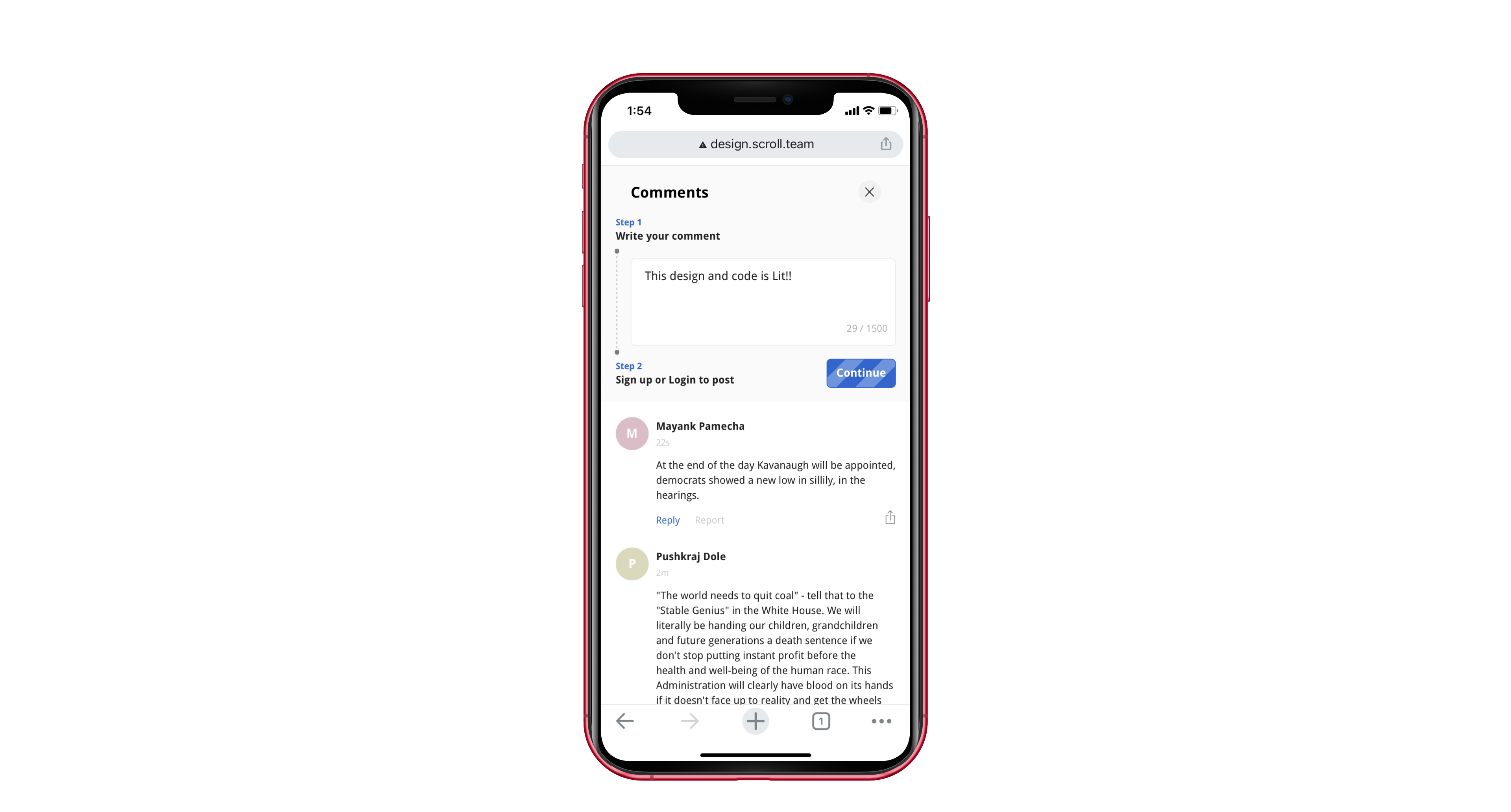
A streamlined design for a commenter that is logged out. Yellow notification design as base and maybe divide it into 'Step 1' 'Step 2' sort of visual design for ease of understanding.
-
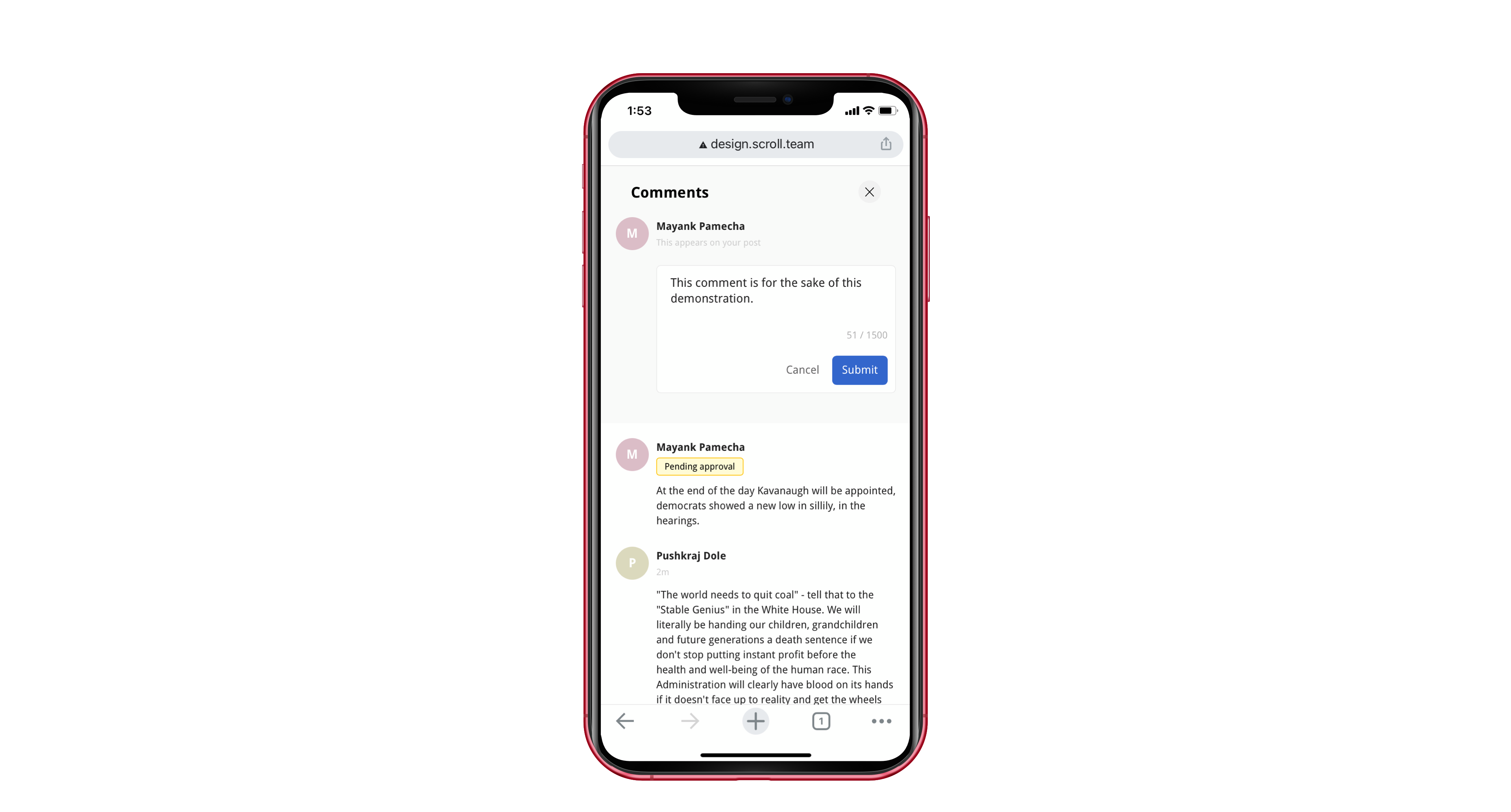
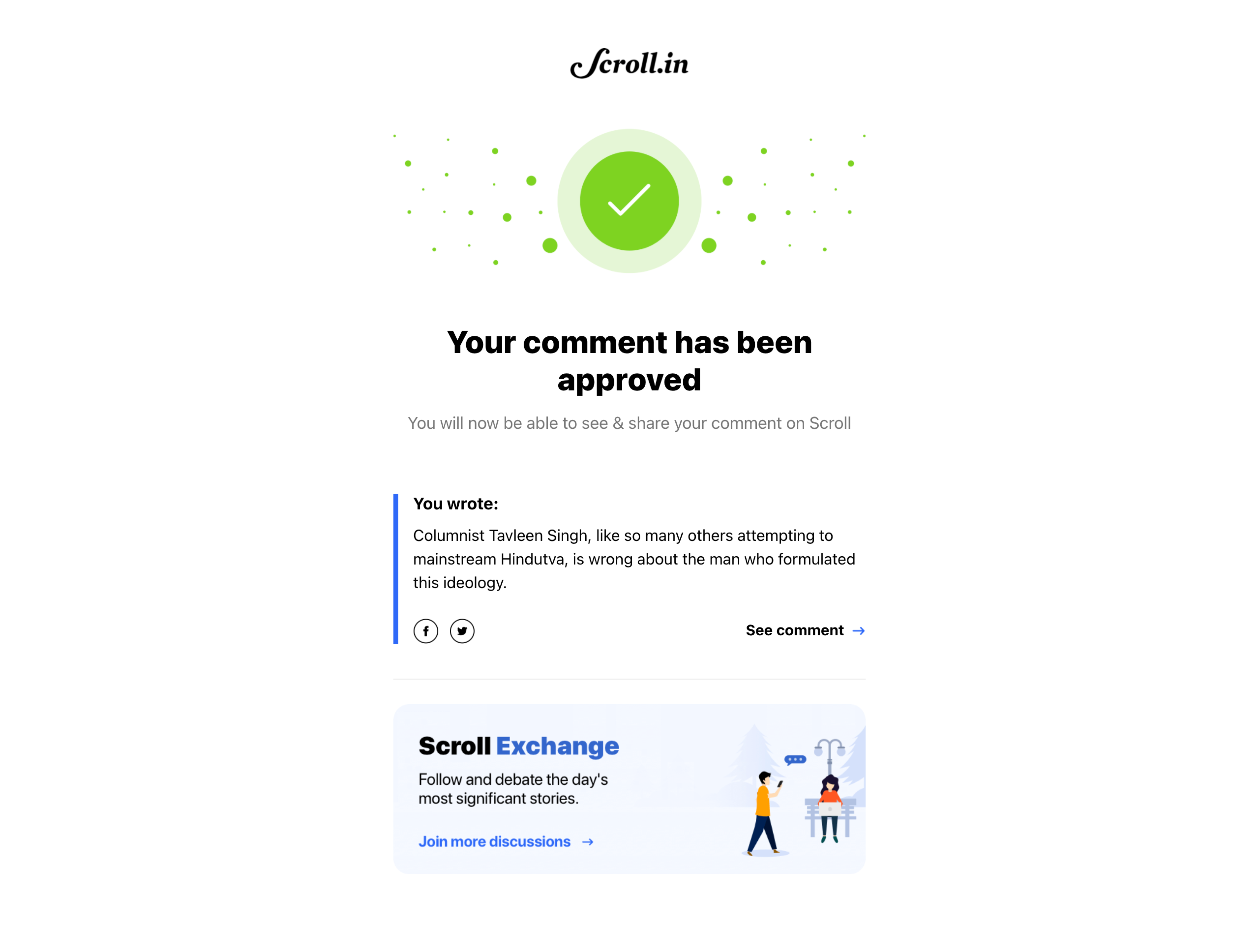
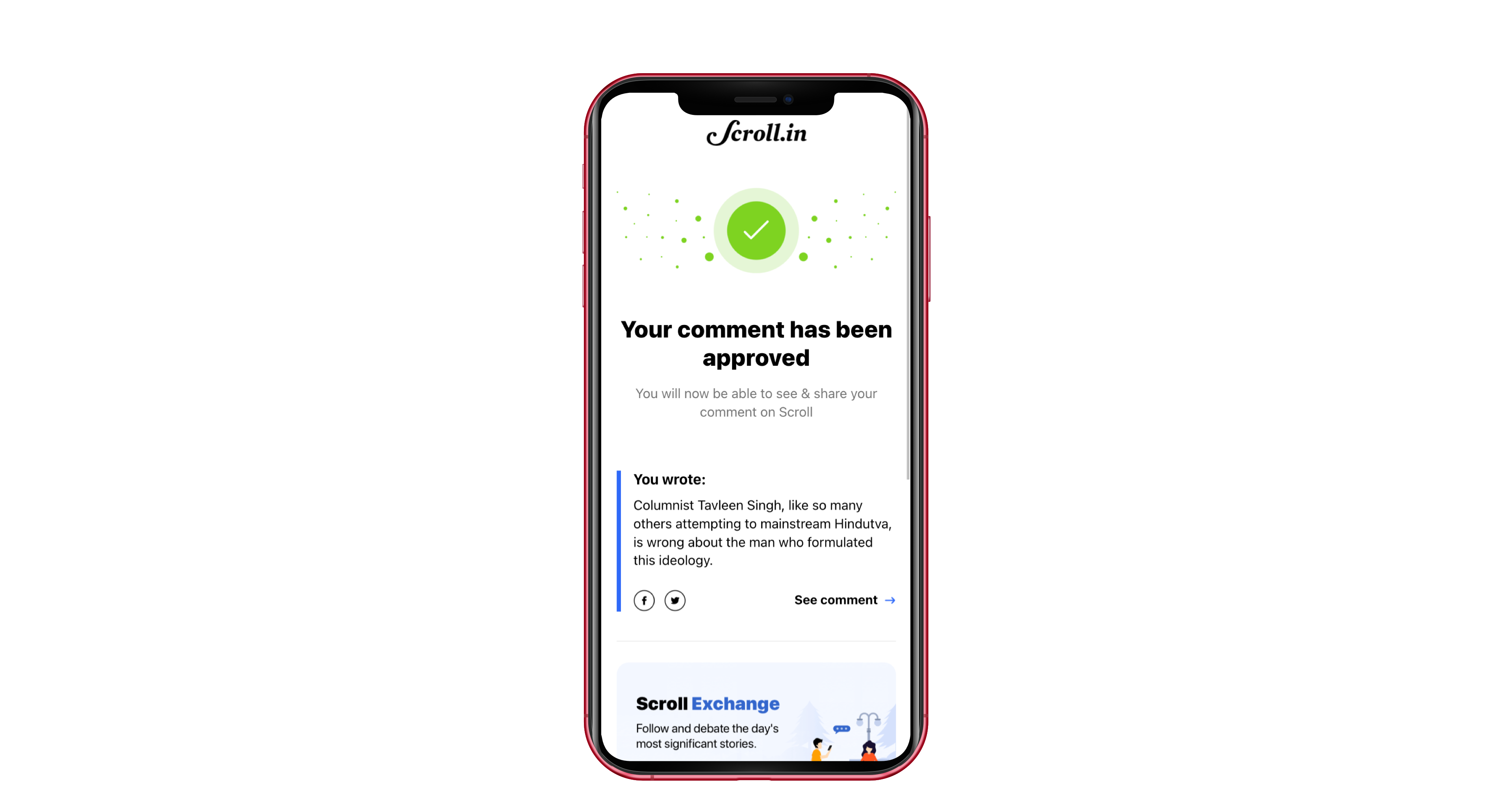
If moderation mechanism exists, maybe send an email to the reader once their comment is approved.
Research: platform comparison
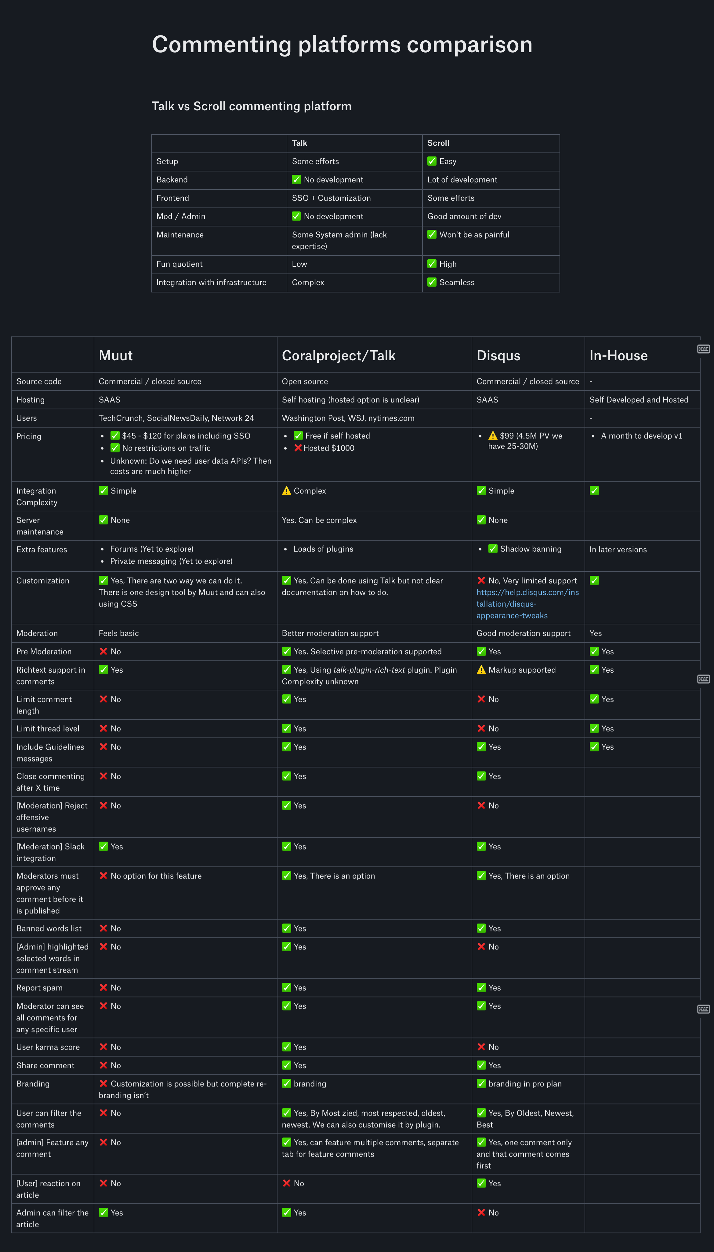
We took a deep research on commenting platforms available in the market by studying the customisation/style guidelines of each platform to better understand the pros and cons.
Customization guidelines for respective platforms
Visual designs [Touchpoints]
Comments entry points
There are 2 entry points for the comments. One is at the bottom of the article and another one at the share sheet. For mobile the first entry point lies next to share meta to avoid scroll at the way down to comment on the article.
Comment Panel (logged-out) + Signup + OTP


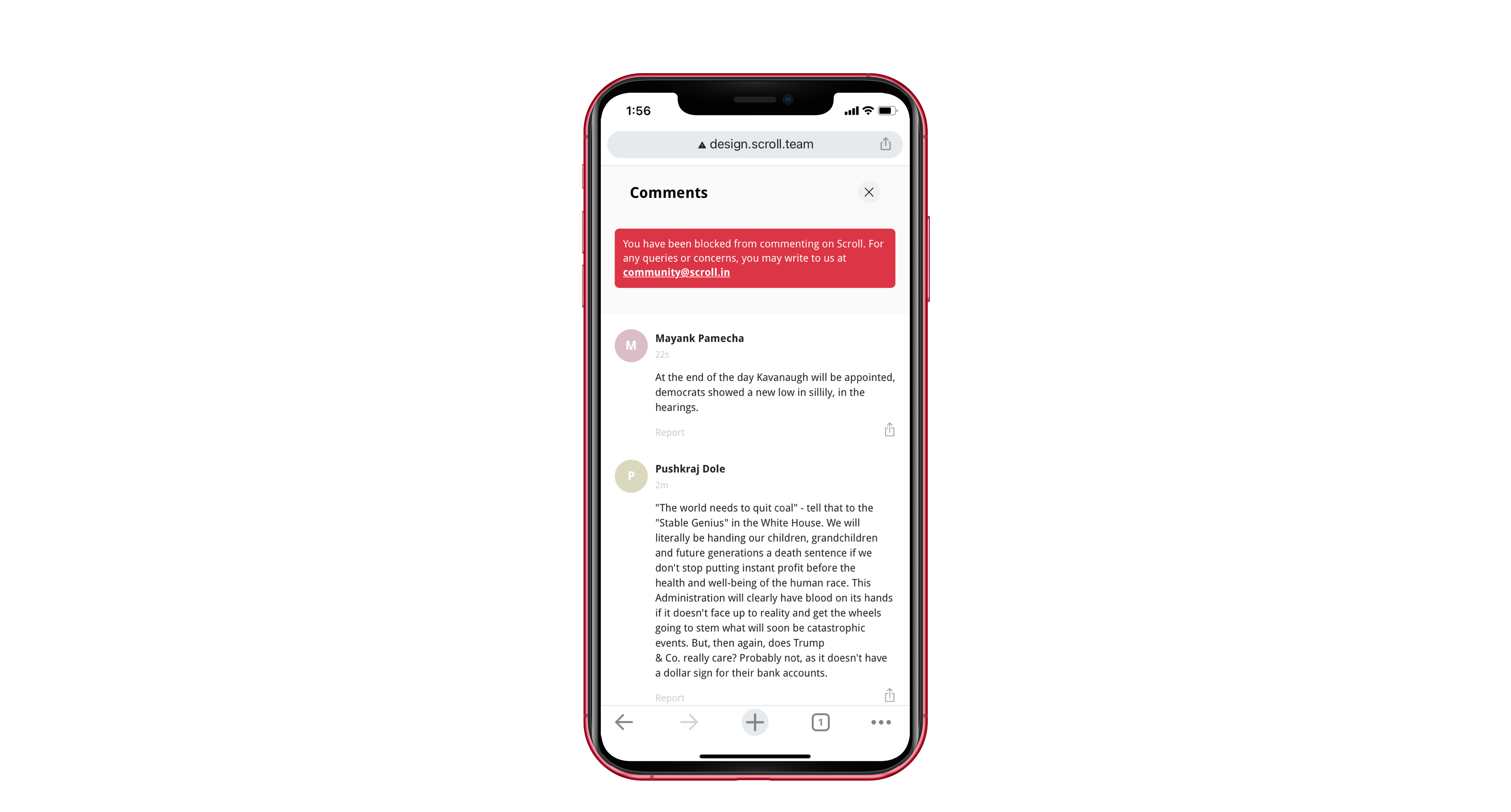
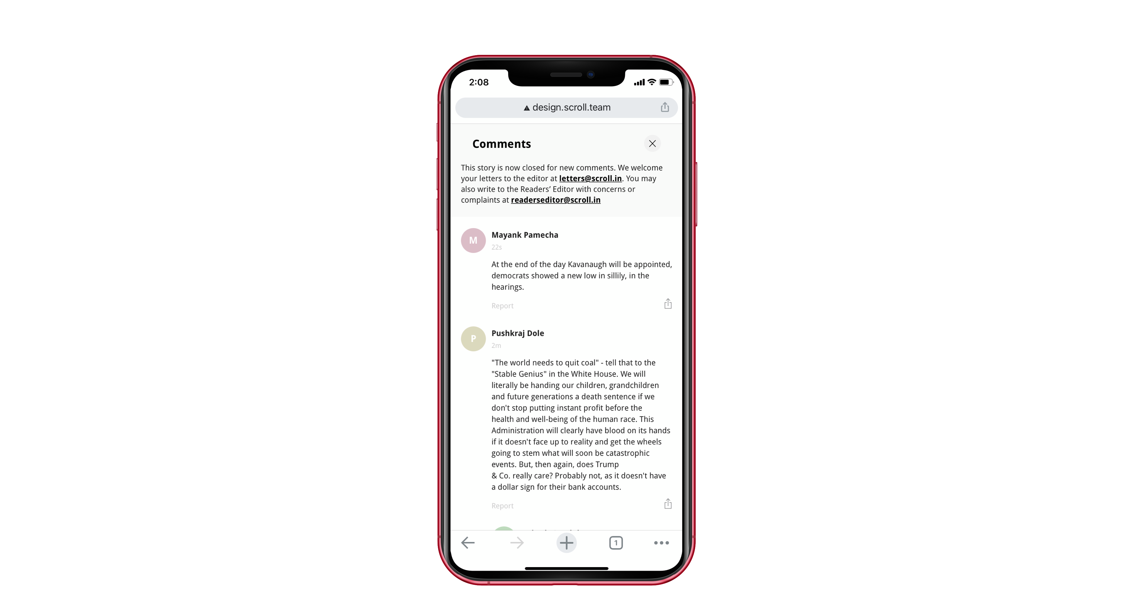
Comment Panel (logged-in) + banned reader



Emails
we send an email to inform user that their comment has been approved by our moderation team and is now live.
Social Media Ads
